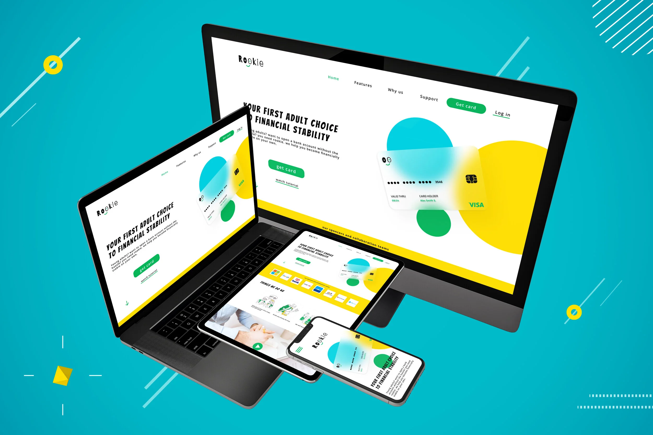
Rookie bank website
during my Google UX design professional certificate, I was asked to choose a prompt and design a user experience and solve a problem for the targeted users I choose.
My Role: Lead ux, User research, wireframing, prototyping, user testing, design system, ui
Project duration: 2 weeks
Team: solo project
THE PRODUCT
Rookie is a banking website for young adults who don’t understand anything about banking and adult stuff, rookie is the ultimate BFF to help and guide young adults to become financially stable.
THE PROBLEM
The current problem is that there is no simple way for young adults to easily open a bank account and understand the process and how to start to be financially independent without the help of parents.
THE GOAL
My goal is to make financial stability and adult stuff easy for first time customers
First things first let’s understand the user
1)Understanding The User
User research, personas, problem statement, user journey map.
User Research Summary
I’m creating a website to help young adults open their first bank account by helping them from start to finish and guiding them to financial independence. I would like to understand what specific challenges the users face in the process of getting a card from the website.
User’s Main Pain Points
The user doesn't understand anything about the banking world and how to manage finances
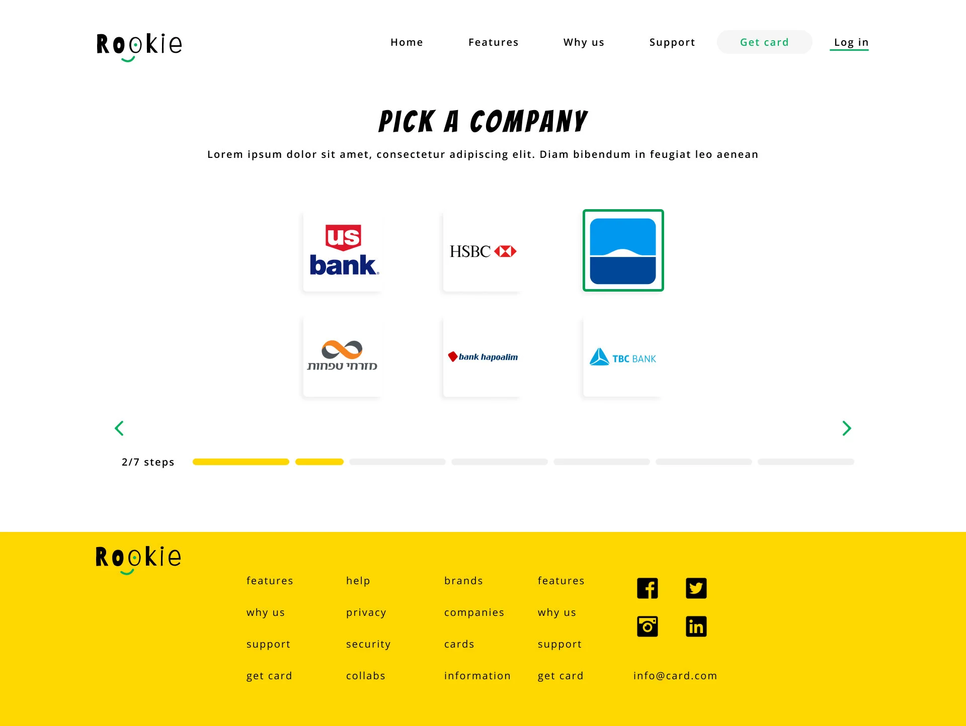
confused by what company to pick for bank account and doesnt know what suits him best
wants someone to guide him along the way but not his parents because he’s an adult
User’s persona:
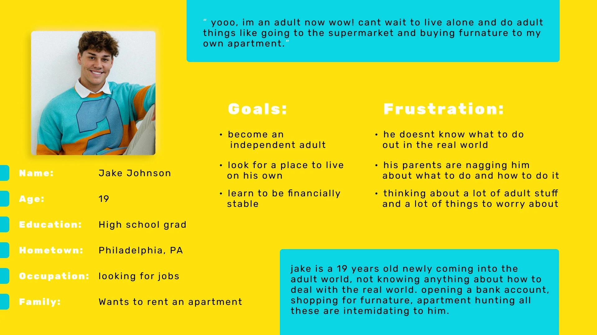
User’s problem statement:
Jake is a 19 years old newly adult starting his journey into adulthood alone who needs to open a bank account in order to start his own finances and booking because he is an adult now who wanna live alone and not with his parents.
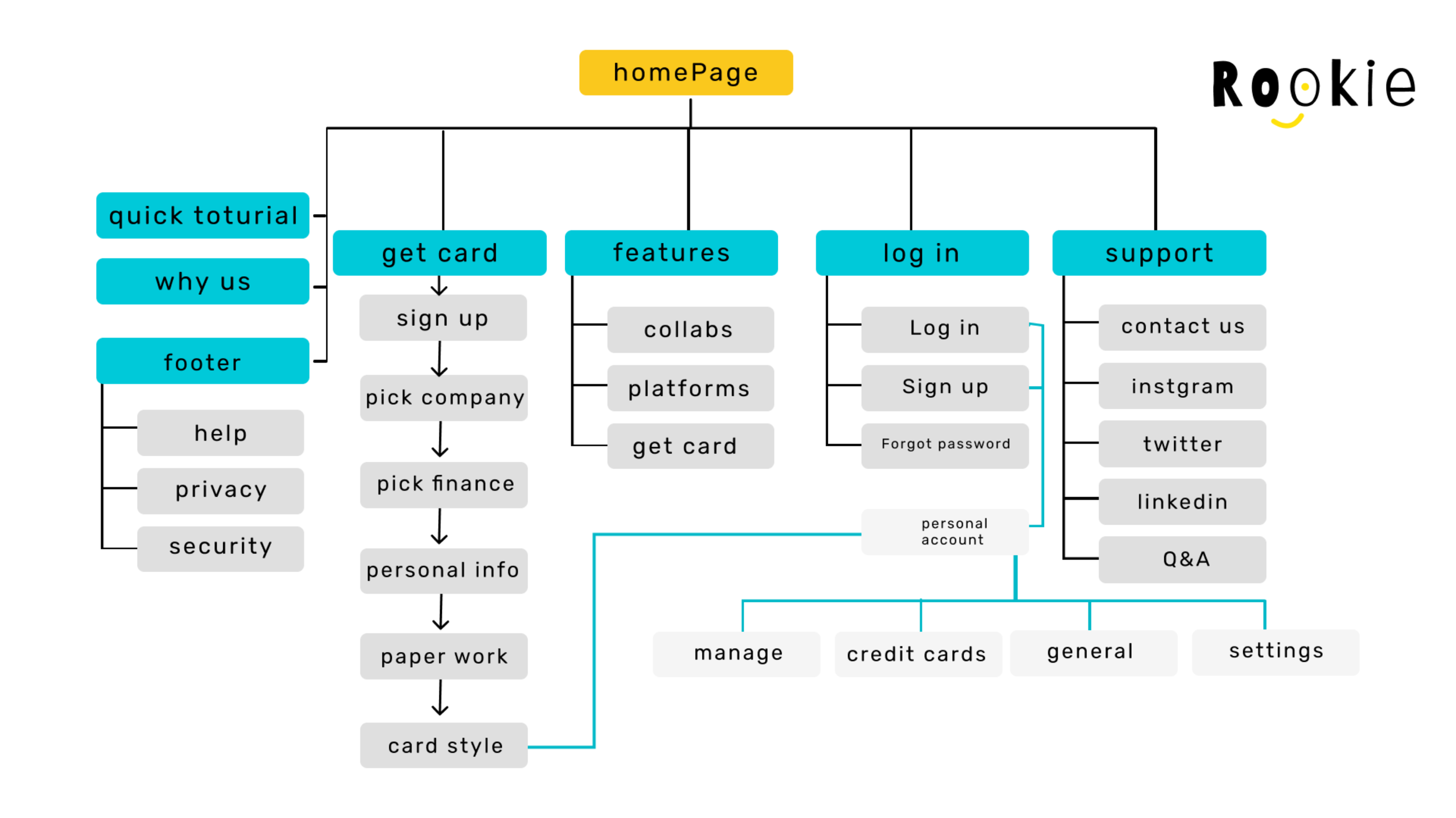
Sitemap:
2)Starting the design
Paper wireframes, Digital wireframes , Low-fidelity prototype, Usability studies.
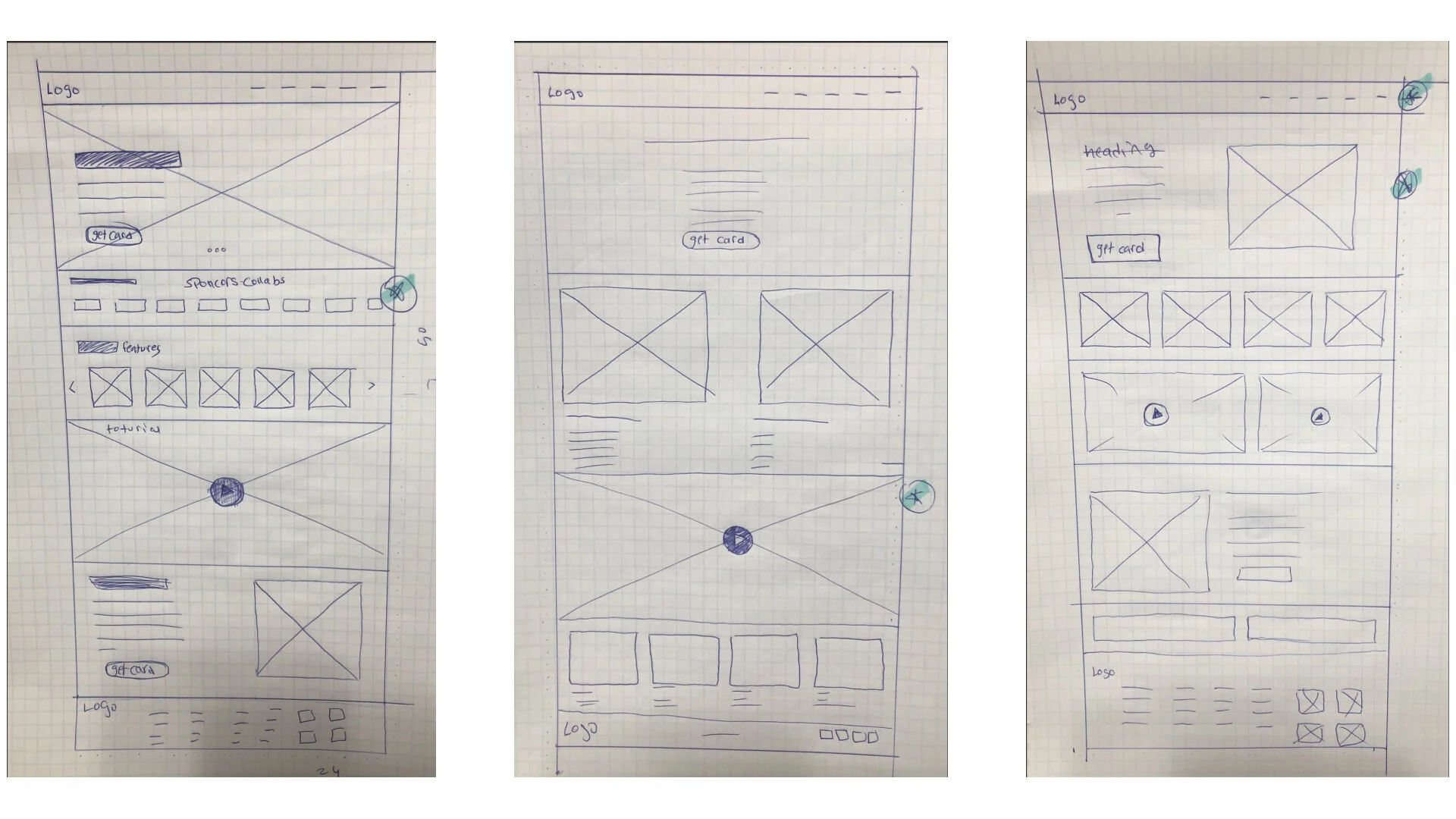
Paper wireframes:
Digital wireframes:
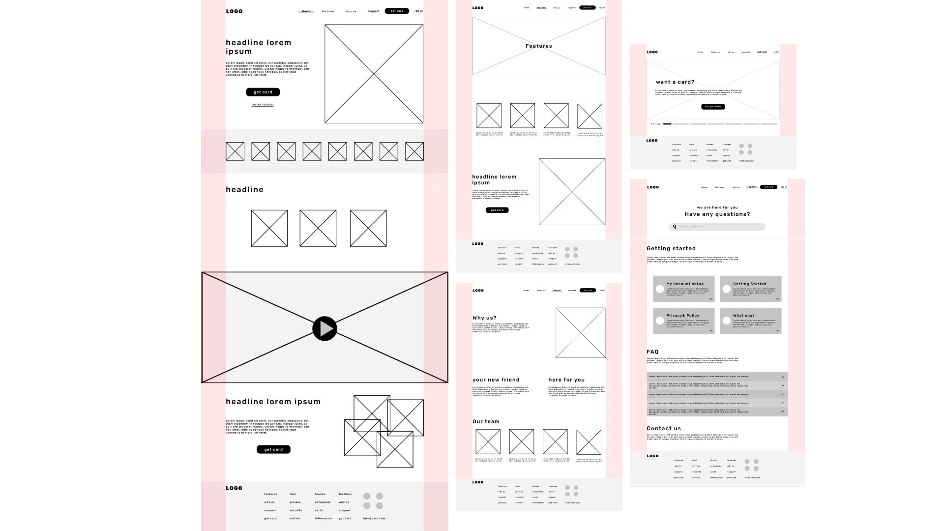
Usability study: findings Round 1
1) 3 out of 5 participants had hard time understanding if they should click on the banks shown in the homescreen
2) 2 out of 5 participants had hard time knowing why there is 2 type of buttons and it was confusing
3) 2 out of 5 participants had hard time understanding why there was pictures of random people at the last section
of the website they felt that they dont need them
4) 4 out of 5 participants would have prefered to see the things we do in illustrations rather than written
3) Refining the design
Mockups , High-fidelity prototype , Accessibility.
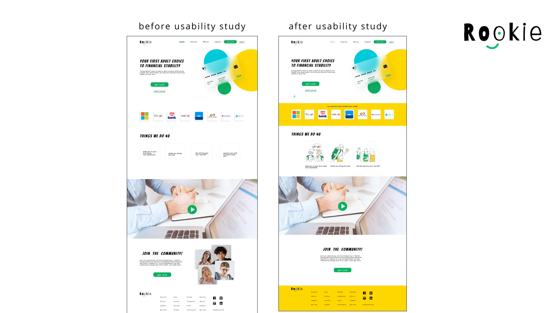
Example of before usability study and after refining using the findings from the usability study
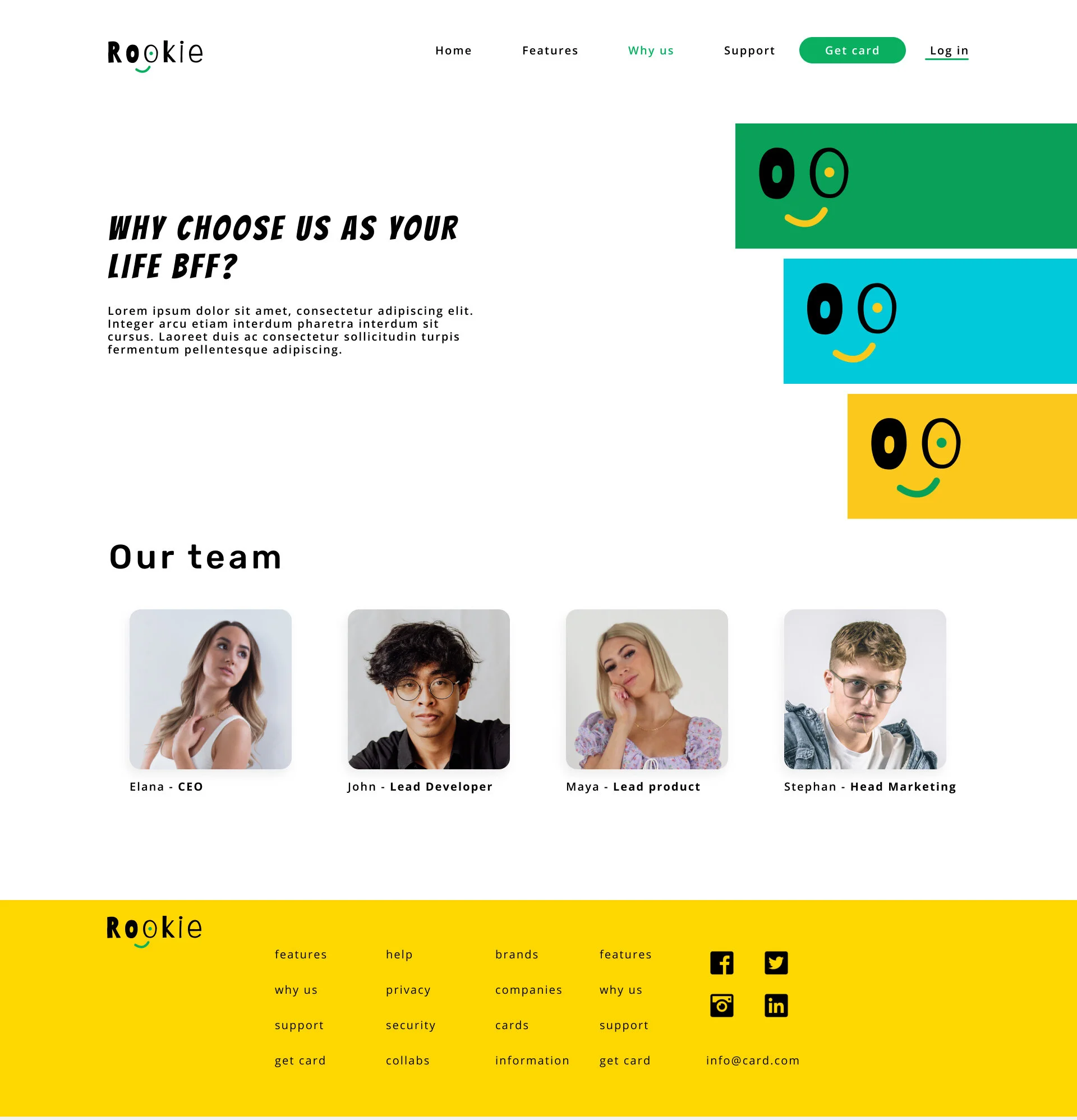
Mockups:
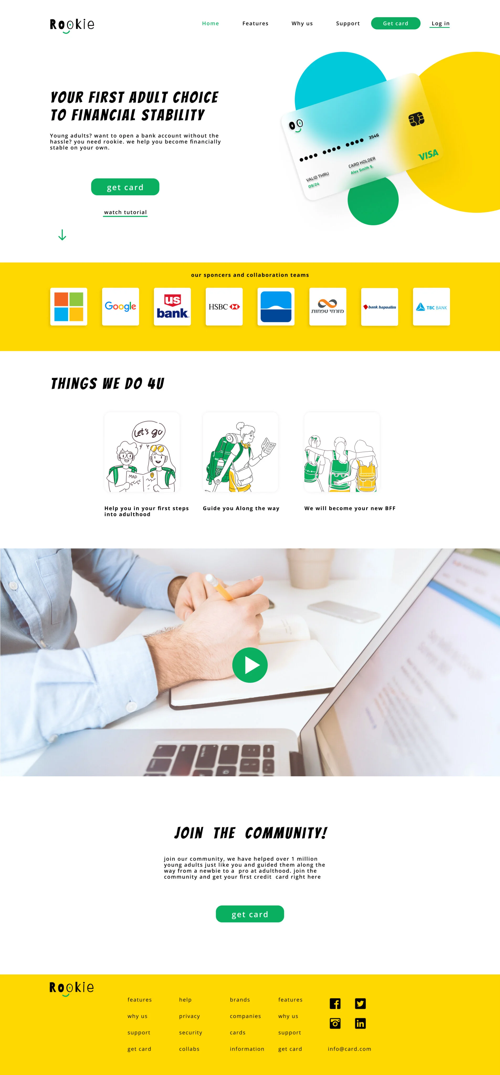
homepage
what I learned from this project
I learned how to understand the user’s needs and how to solve them.
I learned to reduce Biases and preconceived ideas about the user.
I learned to conduct usability studies and how to analyse and synthesize information from the study.